| | 03/01/2017 | 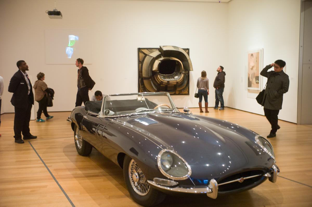
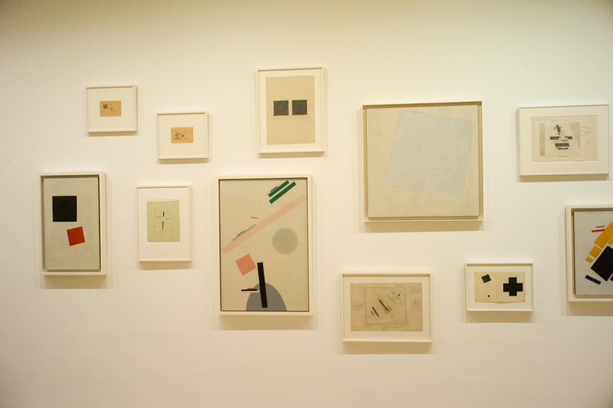
This past weekend, in spite of coming down with a cold, I needed to get out of the house and went to see A Revolutionary Impulse: The Rise of the Russian Avant-Garde at MOMA. I should mention that if you are a NYC resident you can get a NYCID card which among other benefits gets you a free one year membership to MOMA. Which means in spite of being sick, I could pop in for an hour and a half, see the exhibit for free and not feel I had to spend all day because I paid a $25 admission fee (though it's free on Friday evenings).
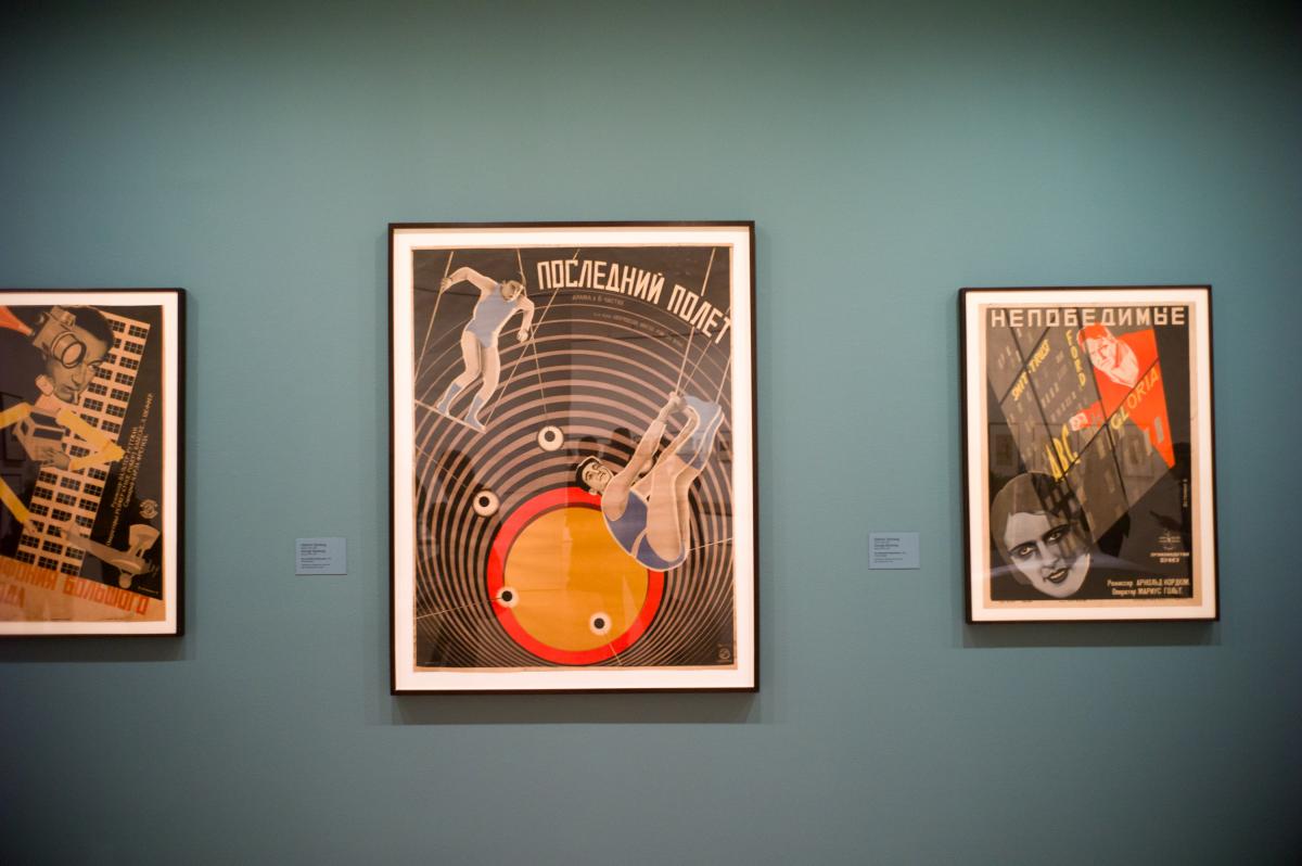
I am a huge fan of Futurism in general so it was obvious I would want to see this exhibit before it closed. But while I was walking through the show I had a thought. Context! The exhibit consisted of pieces expressly made as "art" for gallery shows and other pieces - posters, books, and costume designs - that a century later are recognized as art and included at the show. I realized that I gravitated toward the posters, books and a dining set, my favorite piece, that I absolutely would love to have. I didn't get anything out of the pure art pieces (although a paper sculpture of a head was very cool).
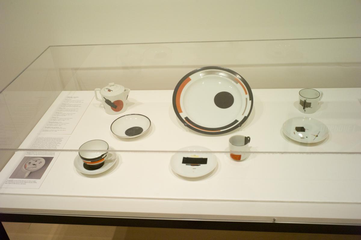
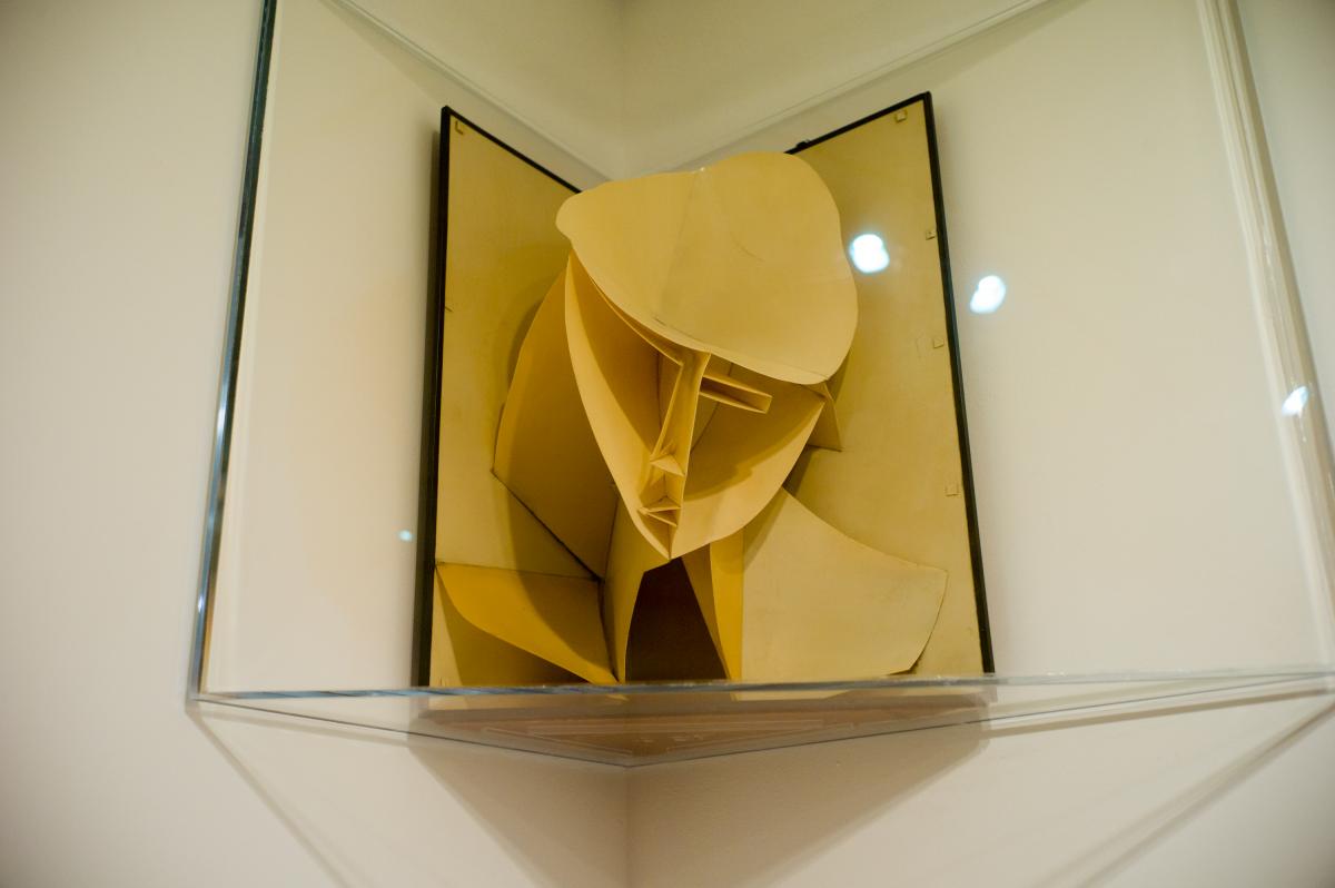
What I realized is that the work intended for public consumption at the time had context. The artists and designers were trying to convey a message and they used the new vocabulary of the avant-garde to express the thought. And the works are POWERFUL. But the gallery material seems far more tentative and maybe experimental (and 15 years earlier, which might have something to do with it). They certainly doesn't hit me over the head. The context is different. The work was intended for a more limited audience that wanted to see "art" and was more forgiving and more indulgent. The message of the work is about the artist, not about some performance the artist was asked to promote in a poster.
Pondering this thought I went to test my theory.
The picture at the top of this blog is of a 1961 E-Type Jaguar, which is the centerpiece of an exhibit from the museum's collection of art from the 1960's. The car had the same impact as the avant-garde posters. First of all, the very fact the Jag was on exhibit shows us that it is now considered art. (To be fair, the car has been part of the MOMA design collection since the late 60's). It blows away everything else in the hall. While the works on the wall might define the 1960's for artists and collectors, for me at least the design vocabulary of the 60's was set by items such as this car. It influenced real world design much more than any art piece on display.
Maybe if I had to draw a conclusion, it would be that the art on the wall is commentary on what the artists saw and felt at the time, but the pieces from the outside world are what changed the world.
Just before leaving I stopped for a minute to see "Starry Night" by Vincent Van Gogh, probably one of the top five most famous pictures in the world. Many people stopped to look and take a picture of it. It didn't have to compete with any objects in the room, and it comes from a time when single paintings drew huge crowds (although not to impressionist work). My son, who is twelve and considers walking around a museum to be mind-boggingly boring, really had a hard time grasping that the picture behind the glass was the original painting and that was what was special about it. Times have changed and I think the ubiquity of electronic images make seeing the real thing less unique, less special. Seeing furniture in real life 3D on the other hand is still something the internet hasn't mastered. Although maybe with VR coming soon, maybe it will.
Modern furniture designers and makers are constantly being told that what they do is craft and not art. Woodworking certainly is craft, but as the Jag shows us, sometimes it's art. It's also pretty hard to make a piece of furniture that when people look at it they go "WOW."
But when they do: "WOW!"

| Join the conversation | |
| The opinions expressed in this blog are those of the blog's author and guests and in no way reflect the views of Tools for Working Wood. |
|
 Joel's Blog
 Built-It Blog
 Video Roundup
 Classes & Events
 Work Magazine


Always enjoy your blog.
For me, successful "art on the wall" imparts a wordless feeling irrespective of the image. It can be representational. It can be abstract. It can, as one particularly fine artist out here manages, hover somewhere between the two.
Thanks for sharing. I do enjoy reading your observations and thoughts.